Solution:
The SPARK team began by creating a fresh new look to the existing logo. From there, a new identity package was developed including letterhead, business cards, a PowerPoint template and brand standards guide. In order to fully support and integrate this new look and identity, HarperLove asked SPARK to build a new website and develop a print advertising campaign.
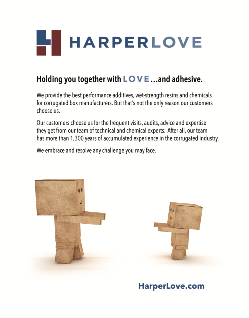
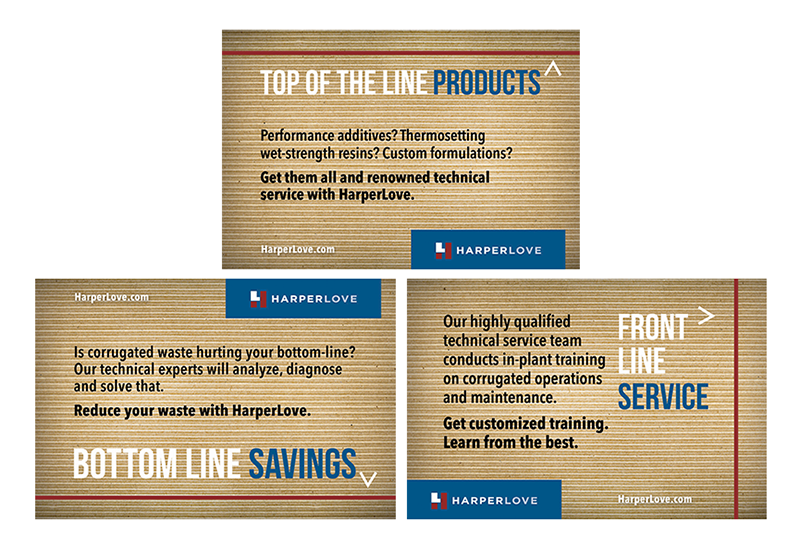
Print advertising for the company had previously focused solely on products and not attributes of the brand. SPARK created new ads featuring HarperLove’s distinct benefits: top-of-the-line products, front-line service and bottom-line savings. In order to further communicate these strengths, create an impact and extend the media dollars, 1/3-page ads were designed (each communicate one of the benefits) and placed on consecutive pages in the publications. The ad designs incorporate a “corrugated cardboard” background to further break through the typical trade advertising clutter. In addition, full-page ads were created to further showcase the brand and featured cardboard “box people”.
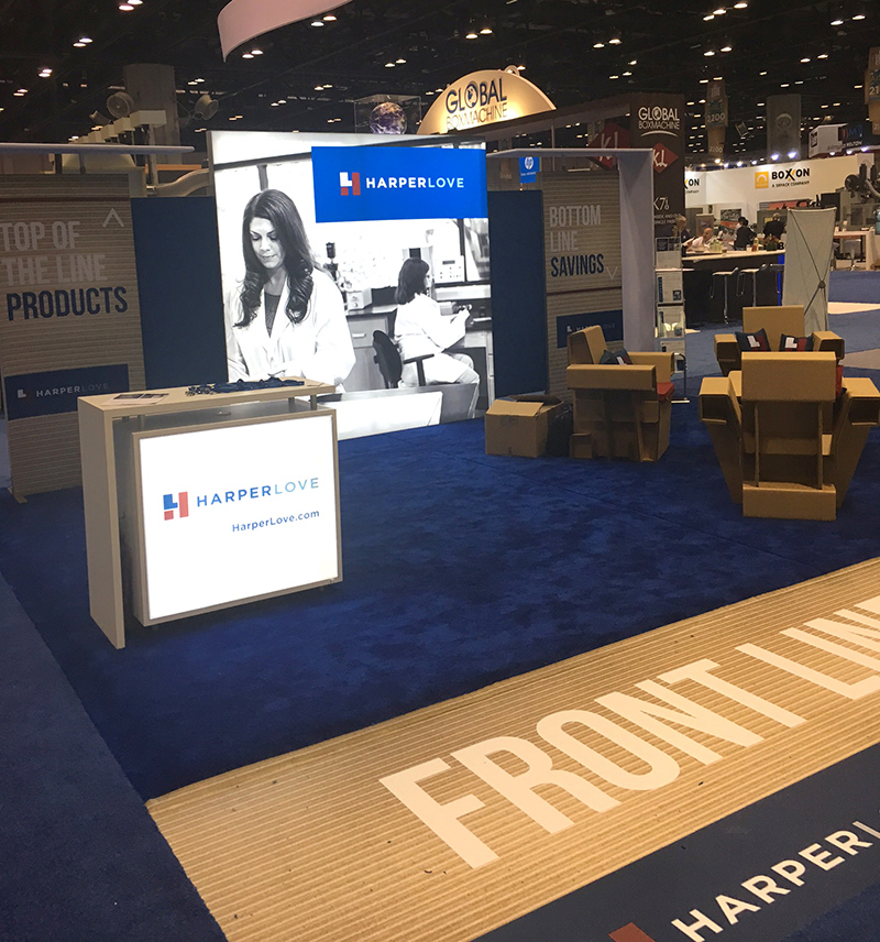
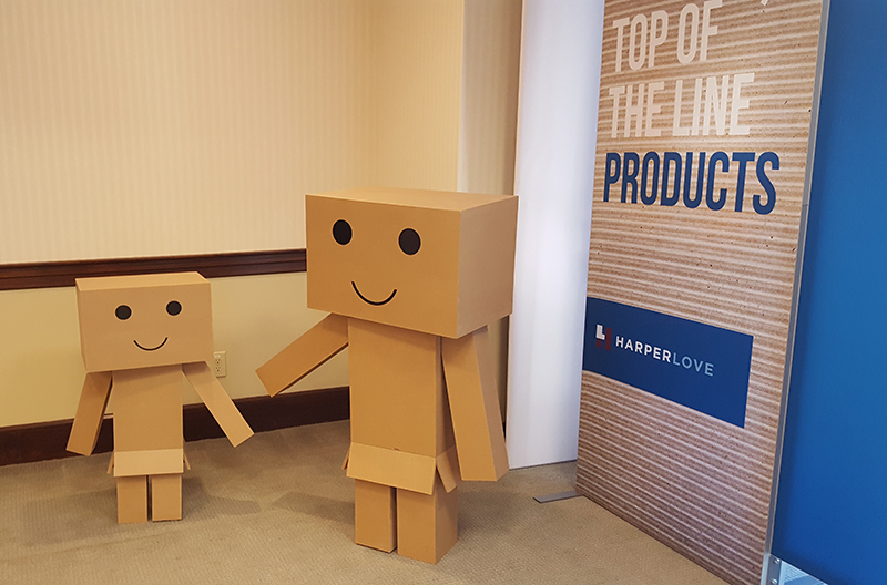
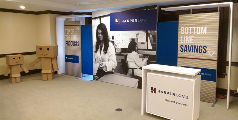
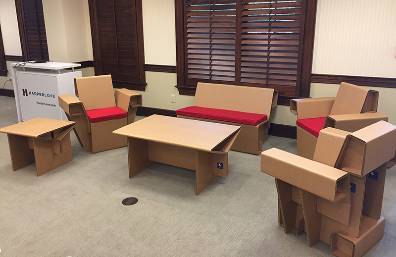
The company also asked SPARK to develop a 20’ x 20’ trade show booth that would showcase the new brand identity and reinforce the new advertising messaging. The physical booth design featured centerpiece back-lit photography and side panels reflective of the print ad creative, as well as a back-lit cabinet featuring the new logo design. To carry the brand integration further, the booth space included a floor decal, a 6’ x 6’ hanging ceiling cube and sturdy cardboard furniture complete with brand-colored seat cushions and custom logo pillows. As a final touch, the “box people” from the print advertising came to life in large 3-D format.